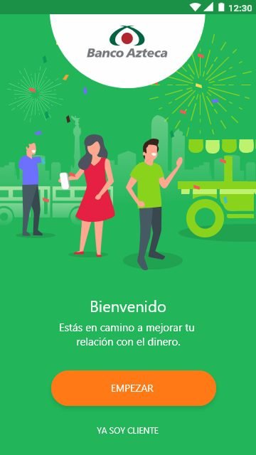
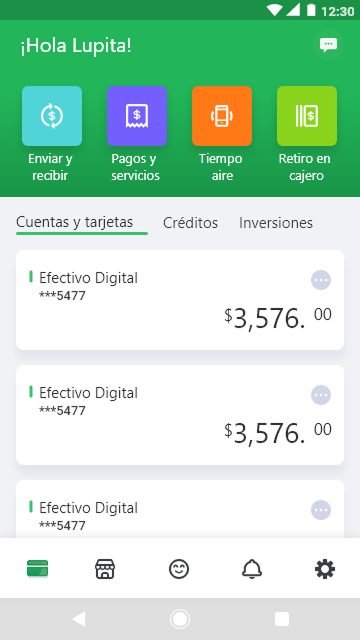
Context & Problem
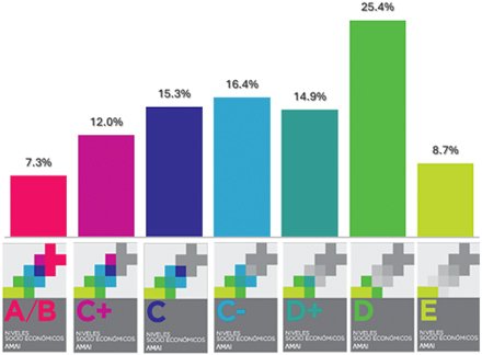
Banco Azteca's mission: bring formal banking to levels D- to C+ of Mexico's socioeconomic scale — a segment historically excluded from the financial system.
Approximately 72% of the population in Mexico.
- Low income, working primarily in informal businesses
- Average education up to secondary school
- First-time or infrequent smartphone users
Design Constraints
Low digital literacy — zero learning curve required.
Low-end Android devices — performance is critical.
App must be lightweight — users delete apps due to limited phone storage.
My Role & Design Process
A team of 4 designers worked on the full redesign over 6 months. My responsibility covered user flows and 40% of the app screens — focusing on the transactional flows and onboarding experience.
- Created end-to-end user flows for registration, onboarding and key transactional features
- Designed 40% of the app screens across Android and iOS
- Ran discovery in the field — guerrilla testing, A/B tests, interviews, prototype and copy testing with target users
- Built and maintained the component library
- CEO changed the color palette when the project was 30% complete — requiring full redesign of delivered screens
- Dual platform delivery (Android + iOS) with a single scalable design system
- App weight constraints required constant collaboration with engineering to optimize assets
Project Goals
Redesign the full app to make formal banking accessible, intuitive, and trustworthy for a population that had never used digital banking before.
I left Banco Azteca in March 2019, so I never saw these measured post-launch. What follows is the evidence I did gather — in the field, before and during the build.
The Problem — Before the Redesign
The original app (launched March 2017) required users to navigate two levels of menus before reaching a core feature — with no progress indicators, unlabeled icons, and empty form fields with no guidance. For users with low digital literacy, every friction point was a potential drop-off.
Research — Field Immersion
Before we were even shown our workstations, we spent 4 days fully immersed in the bank's world and the daily life of our target users.
- Visited a Banco Azteca branch to understand executive operations, most-used products, and internal processes — seeing the bank from the inside.
- Guided ethnographic tour through a low-income neighborhood in Mexico City to observe how the target segment interacts with money, technology, and their environment in daily life.
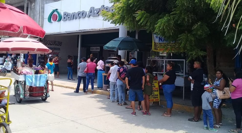
Users didn't distrust banks because of money — they distrusted them because they felt banks weren't built for people like them.
Research Findings → Design Decisions
- Users didn't identify with generic banking imagery
- Plain language was essential — technical terms created distrust
- Emotional connection to family and money goals was a key motivator
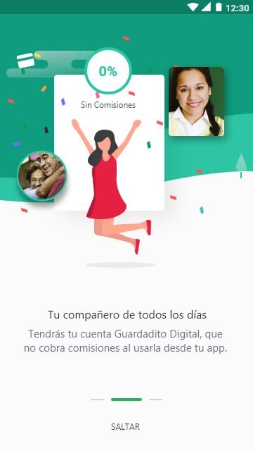
- Illustrations featuring people from the target segment
- Simple, conversational copy throughout all flows
- Onboarding focused on emotional value, not features
Understanding Our Users
Banco Azteca's target goes beyond socioeconomic levels — users are defined by their life stage and aspirations.

Dreaming Dependent
Young individuals focused on learning and surpassing their parents' achievements while living life to the fullest.

Focused Independent
Single individuals or childless couples building a stable, worry-free future through self-sufficiency.
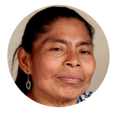
Dedicated Provider
Heads of households prioritizing family well-being and security over personal interests.

Uncertain Self-Sufficient
Retirees or "empty nesters" shifting focus back to themselves and enjoying their time while maintaining independence.
User Personas
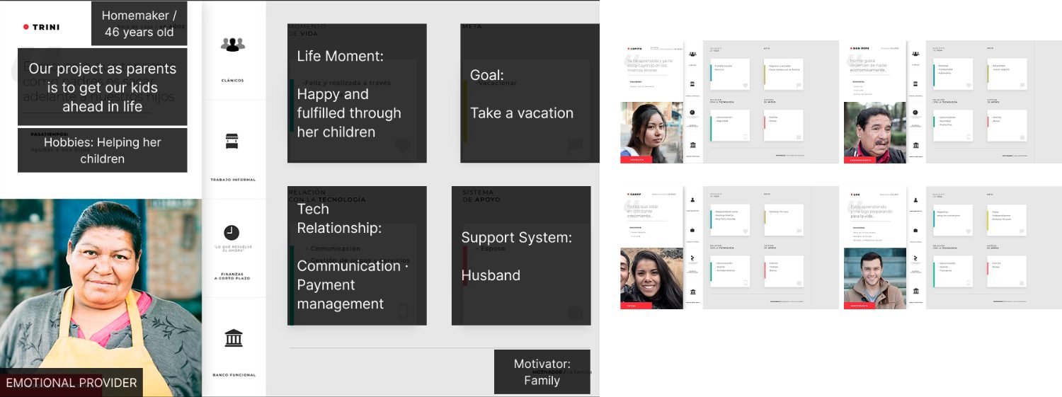
5 personas built from field research and branch interviews — all sharing the same core needs: security, family support, and financial confidence.
Information Architecture
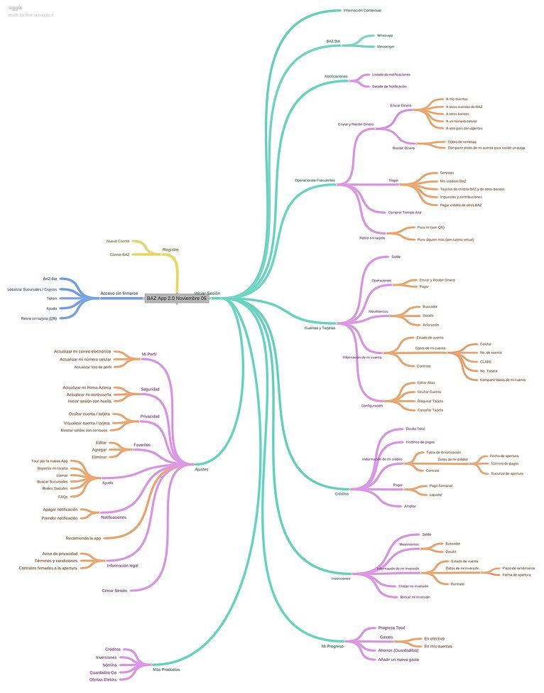
A full app redesign required mapping every feature from scratch — organized around 3 core pillars based on users' most critical needs.
Core Banking
Transfers, bill payments, remittances, airtime top-ups.
Account & Card Management
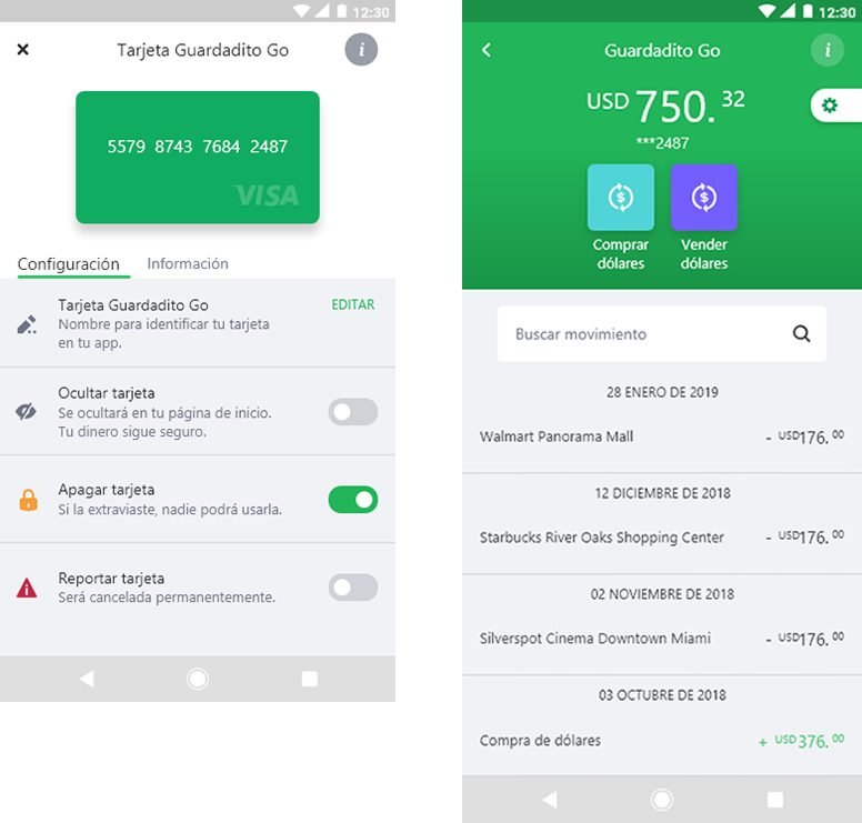
Balance monitoring, transaction history, card security controls.
Credit & Investment
Debt management, savings progress, investment tracking.
User Flows
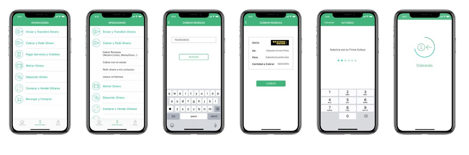
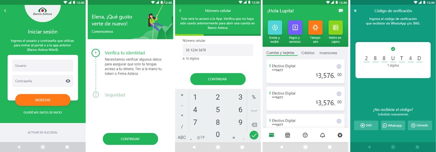
Registration was the most critical flow — it was the first interaction between the user and the bank. We designed two distinct paths based on the user's existing relationship with Banco Azteca.


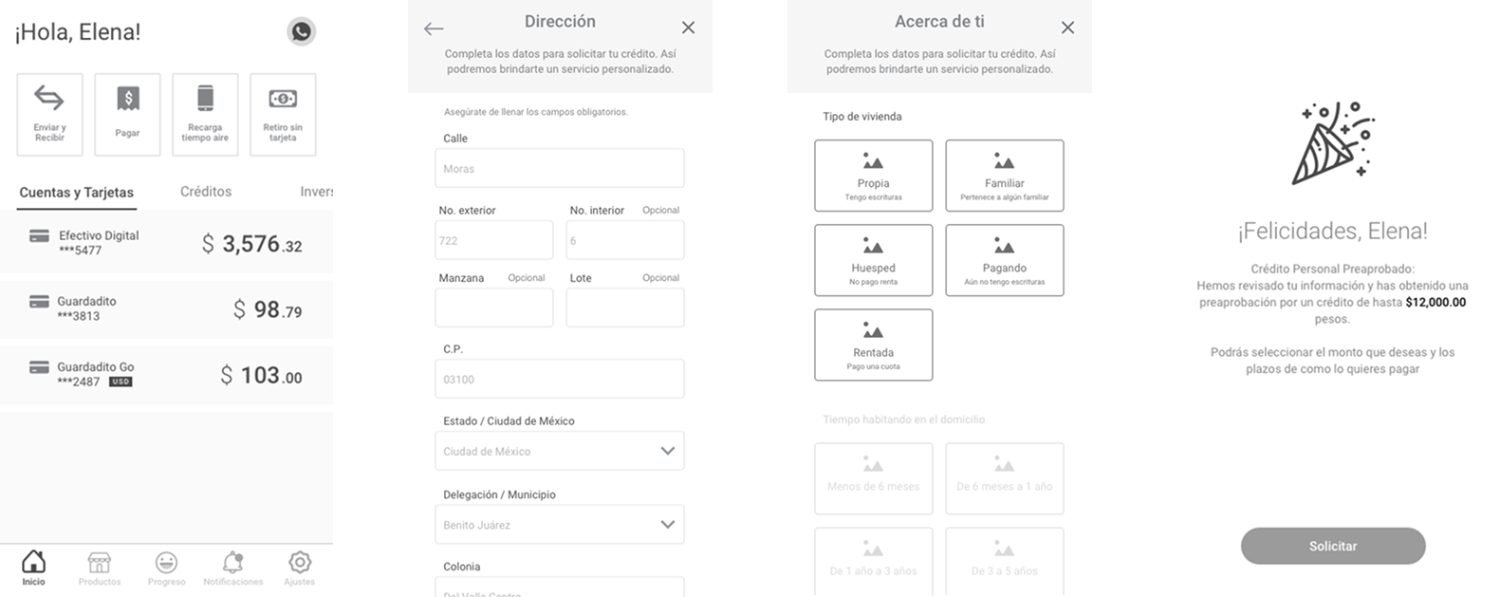
Wireframes — Personal Credit Flow
Before high-fidelity, we mapped every interaction step — validating flows and content hierarchy with the team before investing in visual design.
Final Design
Project Results
I cannot claim the bank's growth as a design result — a retail bank of this size grows through branches, products and market forces. What the redesign did was give that growth a digital surface that first-time smartphone users could actually operate.
What I Took From It
Designing for people who had never used a bank app taught me more about mental models than any project since.
Mental models come first
The hardest part was never the interface. It was understanding how someone who keeps cash at home thinks about a balance on a screen — and designing to that model instead of the one banks already use internally.
I dressed wrong for the field
I ran discovery in branches wearing a suit. People assumed I was from the bank, and they behaved like they were the ones being evaluated — not the prototype. I would dress to disappear next time. What you wear is part of the research method.
One system, not two
We built separate design systems for Android and iOS, because in 2018 that was the convention — platform typefaces and all. I would build a single system with platform-level exceptions instead. Two systems doubled the maintenance and split the team's attention.